 The title of the newspaper “The Metro” (masthead) is written in the largest font on the front cover. A reason for this is so that readers can quickly identify this newspaper as a free local paper. The title is also in bold white text on a blue background which makes it stand out and grab the attention of public transport users. The Metro is distributed on public transport and readers can pick up their copy of The Metro on trains and buses.
 The front cover had subheadings in the left column, this gives the audience a brief outline of what is inside The Metro before they even open the paper. These subheadings Fame, Sport and News are used to target different specific audiences; this is through the colour of text, for example, the subheading for sport is blue carrying connotations of masculinity. The colours are also used as a guide throughout the paper as pages are colour coded for specific topics.


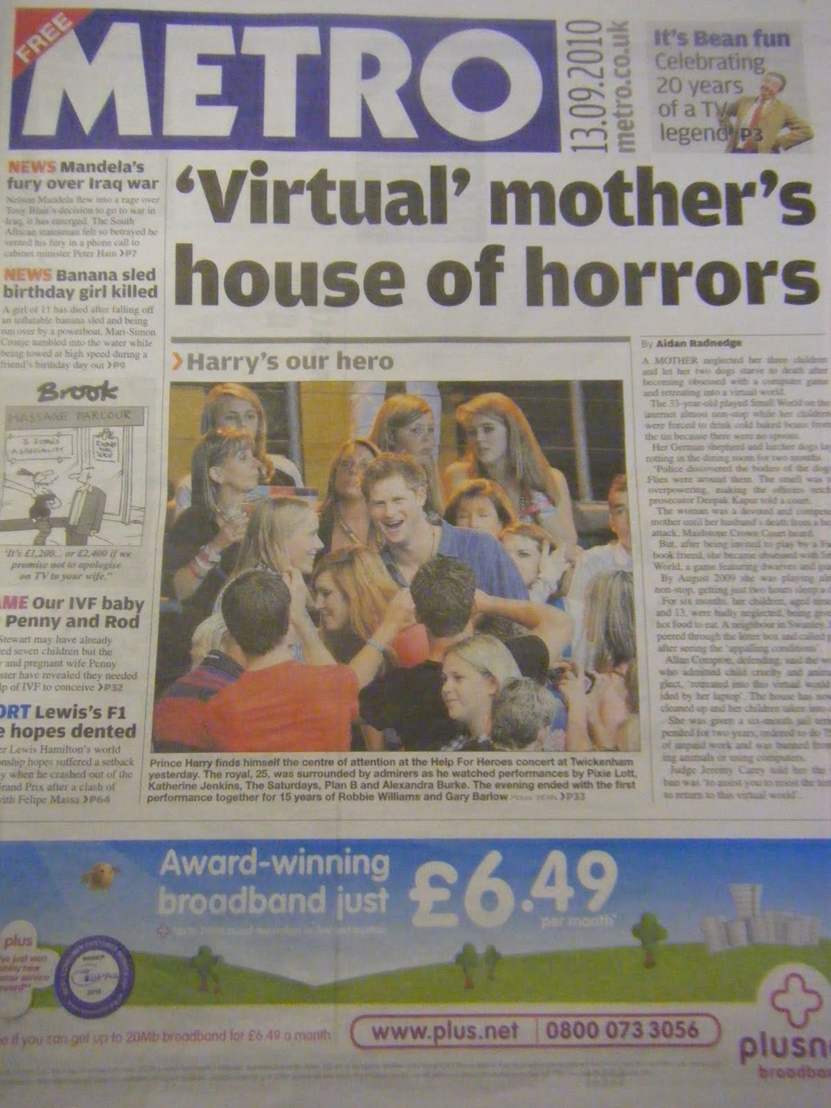
The Metro has one main image on the front cover. This is different to other newspapers (e.g. The Echo) as others more often than not have more than one image relating to different stories on the front cover. This could possibly relate to the price of the newspaper as the front cover is designed to attract as many readers as possible and as The Metro is free perhaps they do not have to worry about this as much. The Metro can afford to take the risk of having one main image and story on the font cover as the newspaper is free and readers will probably pick this paper up regardless of the front page stories/images.
The text surrounding the main image is in columns, a typical convention of all newspapers. The use of advertisements in The Metro is very important as the adverts pay for the cost of the newspaper, as the copies are free.
INSIDE PAGE:
The Metro uses a Menu style contents, which makes it easy for the reader to quickly find what they’re interested in within the paper as they don’t have much time on the public transport.
On the first page is a picture and the weather forecast. This indicates that the readers of The Metro will be traveling and want to know what the forecast will be. It also shows tomorrow’s weather and different places around Europe.
Positioned at the top of the page is the recycling logo, reminding readers to recycle. This promotes the importance of looking after the environment which could appeal to their readers (users of public transport).
The first page also has contact details address, emails and names which helps The Metro to become more interactive with the audience, allowing the readers to give feedback and reviews.
The lottery numbers are placed on the first page alongside an advert for The Metro app for the iPad. The advert for this app is targeting a younger age group with money as the iPad is expensive. The Metro is advertising their own website where readers can receive current news at all times. This suggests that The Metro is a modern and up-to date newspaper.

No comments:
Post a Comment