Thursday, 30 September 2010

Questionnaire Results

The results from the questionnaires show that 6 out of 14 teenagers ages 16-18 do not read a local newspaper. Those that do read local newspaper more than half will pick up a copy once a week or less.

The reason for my teenager not reading the newspaper is due to the content and the stories published are not interesting.

.

Many of my target audience said that they would pay up to 60p for a local newspaper if the content appealed to them. I asked were the most suitable place to distribute a new local newspaper nearly all of the target audience said college. Also the local shops and delivered to the home was appealing to the audience but not asd popular.

.

The most popular choice of why the audience access news if for was music, sport and events. These topics were also mention in what is missing or content should be added. As these topics are appealing to my target audience I will include these with in my newspaper.

Tuesday, 28 September 2010

Questionnaire Results - Charts


As The Echo and Metro were the most popular local newspapers read by my target audience I will look through these papers more often through out my construction of my newspaper to give me more ideas or conventions to follow.
This helps my with the story content of my newspaper and what stories the audience prefer to read.
This question of how do you spend your free time will give me ideas of what my target audience are interested in, for story content or advertisements.
I tried to get a fare amount of both male and females to complete my questionnaire this is so I can have response from both to make my newspaper appeal to males and females.
How old are you, the results only show the similar age range as I handed out to only member of my target audience.


Monday, 27 September 2010

Email

I have constucted an email and sent it to local newspaper, The Metro and The Liverpool Echo. The question I have asked will help me get more ideas for my newspaper, there answer will help me decide content and a layout.

Email adresses:

mail@ukmetro.co.uk

features@ukmetro.co.uk

andrew.campbell@liverpool.com Executive editor

maria.breslin@liverpool.com Head of content

If the newspapers reply I will post the reply at a later date.

Email:

Hello,

My name is Melissa Hampson and I am currently studying A Level Media at Roby Sixth Form. For my coursework I have to produce a local newspaper. For my research I have been analysing current local newspapers, including yours and it would be a great help if someone from your newspaper could give me some feedback please. I have put together several questions if you could please answer some or all of them:

Who is your target audience and what do you target audience like to see the most in your newspaper?

How is the content of your newspaper divided between topics (sport, real life, gossip, factual news, advertisements)?

How do you decide what stories are news worthy for the front page and what stories need images alongside them?

Thanks

Melissa Hampson

Hampson_423@hotmail.com

Thursday, 23 September 2010

Analysis of Newspapers - The challenge

The Challenge

Front Cover:

The Challenge is a free local newspaper, distributed in a colleges, schools, offices and many community building around the local area of Knowsley. This means the stories inside will interest the residents in Knowsley, college students and parents of students.

The Challenge masthead has a red block box around it positioned at the top of the newspaper (this is code and convention of all newspapers.) The text of the masthead is white and bold, this is not the biggest text on the front cover, as the main headline is bigger font size.

The Challenge front cover contains a lot of text compared to the other newspaper I have analyzed. To me the more text on the front cover suggest that the newspaper should be targeting a more older age group.

The main headline in block white text on a black background this stands out, immediately eye catching “COUNCIL FACE SHORT OF £30M” This text is also underlined which makes the headline become more important,

There are two images on the front page, one of teh image is lead for the main headline the other image is used as an insight of what is inside the newspaper.

The challenge contains two display ad's on the front cover these both are very relevant readers of the local newspaper. The first advert is for a local taxi company including the phone number and bold. The second advert is for a ‘Youth Theatre” this is targeting younger reader and the parents to take them to community events and clubs.

The Challenge has contents on the right hand side of the newspaper, showing the reader what’s inside and on what page. This contents in most newspapers are positioned on the inside page not front cover.

The Challenge front cover has used the colour read.

The colours red and blue are used in the other local newspaper disturbed in this area of Knowsley/Liveprool this is now becoming a code and convention within this area

Inside Page:

The inside page of this newspaper is different to most other newspapers as there isn't a contents section as this is positioned on the front cover.

The Challenge inside page contains a lot of different stories and information, which is not seen as much in most newspaper first page. I think that there is too much filling the page making it look overcrowded and t much for the reader to read on the inside page.

There is a range of different font sizes highlighting the main stories to the information that is not as important or as interesting.

The main headline on the inside page of The Challenge is 'Aid for Pakistan reaches more than £1000' This may be relevant to people of an older generation in Knowsley but not for people of a younger generation so this doesn't relate to their target audience of college students as that’s were this newspaper is distrusted.

The Challenge inside page has not got relevant information/stories for all there target audience there is nothing for the student of college. As they will not be interested in, Public Notice or the Crime updates.

There is a display ad for Clarendon College this relevant parent who have young children attending.

I don't believe that the inside page is relevant to the target audience of college students. The information and stories inside are relevant to people in Knowsley but not appealing to college students or younger generation.


Tuesday, 21 September 2010

Analysis of Newspapers - Echo


Liverpool Echo Liverpool Echo is a daily local newspaper published for distribution across Liverpool and many other areas across Merseyside. The Echo is published every evening and costs 49p.

The echo includes the official website link at the top of the newspaper which gives the reader the option of browsing the website and possibly reading online.

Front Cover


The Liverpool Echo masthead is instantly eye-catching as it uses capital, bold, white letters with a Red background. The colour red gives strong connotation of Liverpool (due to the Liverpool football club).

The title also includes a picture of a liver-bird which is a known trademark for the city Liverpool.

The main headline takes up about a third of the front cover, the text is block black text in capital letter. I think it’s a good idea to have a main heading in such a dominant place as it attracts attention of the readers.

The Liverpool Echo has used a variety of pictures on the front page, one picture representing different stories. This helps attract more readers, unlike the metro using one image. The images on the front will target different audiences to buy the newspaper; this will maximizes the profits by appealing to a wider audience.

At the top of the page are three images alongside text. First image is Stephen Gerrard a football player who plays for Liverpool FC as this is a local newspaper many of the readers will support his team. This image also has a red (supporting LFC) blurb telling the reader what page the story is on. The next image has a blue blurb with a headline relating to an Everton FC story inside.

“Echo baby of the year 2010 – Entry form inside” This will attract all ages with a new baby in the family who can register their baby.

Also there is a picture next to the main story, it’s a small photo which fits to the left side of the main heading.

The advert at the bottom of The Echo is advertising a pawn broking, which gives easy cash. This adverts target the older readers, who will have jewellery. The advert stands out at the bottom of the page as it uses full colour red, blue and gold.

This newspaper has a strong front page as there is something for everyone. The reason for most people to be interested and attracted o buy a newspaper is by looking at the front page. The colours used represent Liverpool and the red/blue work well together. The layout used includes the right amount of information and images and doesn’t appear crowded and cluttered.

The Echo First page

The first page of The Echo has a headline positioned at the top, which is in the middle of the page. The font is a bold and black text which is eye catching. The headline is the main story of the first page but it doesn’t contain any images alongside it.


Also on the first is a secondary lead story that’s has two main images of celebrities this makes the page look more interesting for the audience. The two images and leaf text have a box around the story content in a pale blue, this makes the story stand out and gives colour to the paper making it more appealing.

There is a small header 'Inside today' which is a contents of the newspaper positions in the left hand corner giving a brief introduction of what is inside the newspaper that day.

To fill up spaces around the page the echo has used fillers. The fillers used are different stories each containing their own smaller sub heading separating them from the main story.

Positioned in the top left hand corner “Online today” which means that the newspaper has their own website for up to date information.

The Echo has a contact us column, this allows the readers to be able to get in touch with the newspaper making The Echo more interactive for the reader.


Monday, 20 September 2010

Analysis of Newspapers - The Metro

The Metro
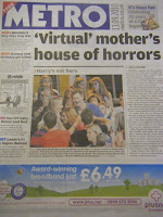
The title of the newspaper “The Metro” (masthead) is written in the largest font on the front cover. A reason for this is so that readers can quickly identify this newspaper as a free local paper. The title is also in bold white text on a blue background which makes it stand out and grab the attention of public transport users. The Metro is distributed on public transport and readers can pick up their copy of The Metro on trains and buses.

The front cover had subheadings in the left column, this gives the audience a brief outline of what is inside The Metro before they even open the paper. These subheadings Fame, Sport and News are used to target different specific audiences; this is through the colour of text, for example, the subheading for sport is blue carrying connotations of masculinity. The colours are also used as a guide throughout the paper as pages are colour coded for specific topics.

The date ‘13.09.2010’ is positioned at the top of the page and it is big and easily seen. The style used for the date is straight forward and to the point to target its audience of commuters, as they may not want to read a formal date e.g. Monday 20th September 2010. This style also looks contemporary and modern, suiting its target audience.

The Metro has one main image on the front cover. This is different to other newspapers (e.g. The Echo) as others more often than not have more than one image relating to different stories on the front cover. This could possibly relate to the price of the newspaper as the front cover is designed to attract as many readers as possible and as The Metro is free perhaps they do not have to worry about this as much. The Metro can afford to take the risk of having one main image and story on the font cover as the newspaper is free and readers will probably pick this paper up regardless of the front page stories/images.

The text surrounding the main image is in columns, a typical convention of all newspapers. The use of advertisements in The Metro is very important as the adverts pay for the cost of the newspaper, as the copies are free.


INSIDE PAGE:


The Metro uses a Menu style contents, which makes it easy for the reader to quickly find what they’re interested in within the paper as they don’t have much time on the public transport.

On the first page is a picture and the weather forecast. This indicates that the readers of The Metro will be traveling and want to know what the forecast will be. It also shows tomorrow’s weather and different places around Europe.


Positioned at the top of the page is the recycling logo, reminding readers to recycle. This promotes the importance of looking after the environment which could appeal to their readers (users of public transport).


The first page also has contact details address, emails and names which helps The Metro to become more interactive with the audience, allowing the readers to give feedback and reviews.


The lottery numbers are placed on the first page alongside an advert for The Metro app for the iPad. The advert for this app is targeting a younger age group with money as the iPad is expensive. The Metro is advertising their own website where readers can receive current news at all times. This suggests that The Metro is a modern and up-to date newspaper.


Thursday, 16 September 2010

Newspaper General Internet Research

Internet Research

A newspaper is a regularly scheduled publication containing news, information, and advertising.

Newspapers are usually printed on cheap, off-white paper known as newsprint. This is used to save money in publishing and to make it cheaper for the readers.

“By 2007 there were 6580 daily newspapers in the world selling 395 million copies a day. The worldwide recession of 2008, combined with the rapid growth of web-based alternatives, caused a serious decline in advertising and circulation, as many papers closed or sharply retrenched operations” (Wikipedia)

Many newspapers are now based online meaning paper copied are not available and readers have to read via internet.

Newspapers typically publish stories on local and national political events and personalities, crime, business, entertainment, society and sports.

Some newspapers the more traditional papers feature an editorial page containing editorials written by an editor and columns that express the personal opinions of writers.

The newspaper is typically funded by paid subscriptions and advertising.

Most newspapers now days include entertainment features such as crosswords, sudoku and horoscopes. Also the weather news and forecasts is printed. Popular in newspapers are reviews, which include everything from restaurants, food to movies, music and plays.

There are different categories of newspapers:

  • Daily
  • Weekly
  • National
  • International
  • Online

Newspapers also come in different formats:

  • Broadsheet - 600 mm by 380 mm generally associated with more intellectual newspapers, although a trend towards "compact" newspapers is changing this. E.g. independent, the broadcast.
  • Tabloids - half the size of broadsheets at 380 mm by 300 mm. Is often perceived as sensationalist in contrast to broadsheets. E.g. The Daily mirror,
  • Berliner or Midi - 470mm by 315 mm E.g. The Guardian

Tuesday, 14 September 2010

Questionnaire - Research

Primary Research

I created a questionnaire that targets both readers/non readers of local newspapers. I asked questions about what people would like to see inside local newspapers. I asked question about the reader such as what are the hobbies and interest this would give me a more idea of what my target audience like These questions would help me construct a local newspaper suitable for my target.

I will give my questionnaires out to my target audience, which is college students. Both male and female aged 16-19. Once I have received back the completed questionnaires I will collect the answers together. This will then help me start putting ideas together for my newspaper.

My questionnaire:

1. How old are you?

_______________

2. Gender (please circle):

Male Female

3. How do you spend your free time?

______________________________________________________________________________________________________________________________________________________________________

4. How do you receive news updates? (tick all that apply)

Newspaper

Internet

TV

Phone alerts

Radio

Other___________________

5. What do you access news for? (tick all that apply)

News

Events

Spots

Music

Celebrity gossip

Other__________________

6. Do you read local newspapers?

Yes No

7. If so, how often and what local newspaper(s) do you read?

Daily once a week Other__________

The Echo Knowsley Challenge Metro Merseymart Other____________

8. If not, why don’t you read local newspapers?

Price

Content

Other__________________

9. How much would you be willing to pay for a new local newspaper?

Free 10-20p 20-40p 40-60p

10. Where would you like a new local newspaper to be distributed?

College

Shop

Home

11. What do you think is missing from local newspapers?

_________________________________________________________________________________________________________________________________________________________________________________________________________________________________________________________

Monday, 13 September 2010

Schedule

I am going to schedule the order I aim to complete my coursework. Having a structure to my work will allow me to manage my time effectively.

For the research and planning stages I will give myself 4 weeks. I aim to complete the construction in 8 weeks. I will use the remaining 5 weeks to evaluate my final products collecting as much audience feedback as I can.

Firstly I will identify my target audience.

My basic schedule is seen below. In it I have listed the main stages and what I should be planning or researching in each stage.

a) Primary Research:

I will create detailed questionnaires which will be distributed to my target audience. I will ensure that the answers given are detailed and effective. To get my out of my target audience I will set up interviews and focus groups and ask questions in more dept. I will record these interviews and use the video clips as evidence. Once I have my results I will present the questionnaires in graphs this will allow me to visually identify trends.

b) Secondary & Market Research

I will analysis the local newspapers this will allow me to identify the different conventions and whether I will conform or challenge these to fit my target audience. I will email local newspapers such as The Knowsley Challenge and The Echo. To discuss the market and what features make an effective local newspaper.

c) Planning Construction:

Using the audience feedback from questionnaires and focus groups I will start to plan the construction of the newspaper. Planning and coming with ideas for the layouts, title of newspaper, content, and colours.

d) Tasks

Brief research into the conventions of radio adverts and advertisements posters. Develop these conventions, but use them with 'young/youthful' elements identified during my newspaper research.

e) Audience Feedback

I will record any audience feedback i get from my 3 products.

f) Evaluation

When evaluating my final product will be critical

To present my evaluation I will create an interactive PowerPoint presentation.

Thursday, 9 September 2010

For my A2 Media Studies coursework this year, I am going to produce the first two pages of a local news paper with a radio advert and an advertisment poster.

I will begin with creating an idea storm, thinking of a title, the target audience and ideas foy my content. Once I have my ideas I can start my planning and reserch.

I need to make sure this year I plan a schedule to stick to as a guide to follow. This will keep me up to date.