I have started to add images and text into the layout of the newspaper this gives me more of an idea about space and how the newspaper will look. I can also show different ideas to my target audience and see their opinions.
The inside page I used different colours for the contents. This is bright making the newspaper colourful but it doesn't link with the colour scheme and makes the newspaper look more like a magazine and not have the front page matching the inside.
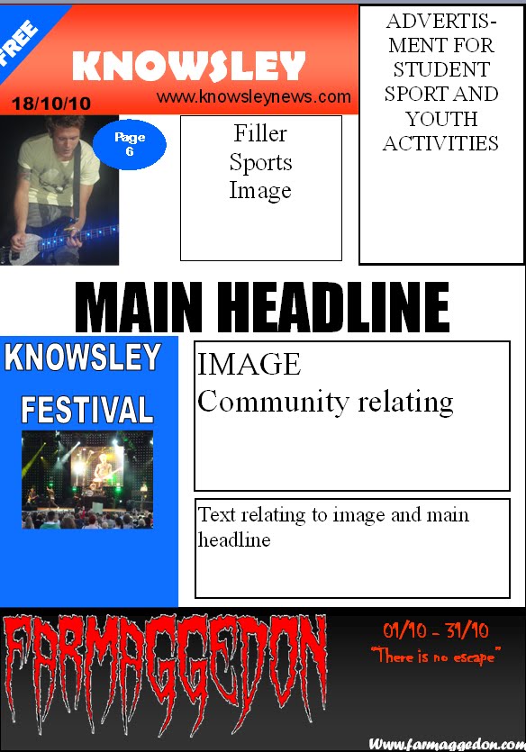
The main image is of a girl band, my story for this image will relate to student have them attend a local college radio station.
The display advert is for Top Shop. This is an image I took from outside the store in Liverpool. I used a green border around this thinking it would stand out and look attractive.

This is the front page, the masthead is still at construction stage but i like the idea of conforming to the traditional newspaper colours of red, blue, white and black. Also the style of The Echo. The display advert at the bottom will be completed after I have taken the images, I will use a font style for "Dafont" an online font website were you can use and download different font styles. I will use of font under the horror catagory relating to Farmageddon and the halloween season.
 This advert of the recite represents The Sun newspaper a getting loads for a low price of 30p. The list shows what contents is in the newspaper this tries to appeal to different audiences.


 This set of 3 adverts for The Metro is telling the audience to have a look inside 'Dip in' that the metro is 'Light reader' easy reader for on the go, traveling and just to 'Grab one' as the newspaper is free why not grab one and take a look.